Thursday, December 1, 2011

VISC 202 Reading Questions


_ What are some ways to indicate a new paragraph.
Usually a new paragraph is shown when you indent the first line.  However, there are other ways to show it too.  For example, double spacing, text size, leading, and icons could symbolize a new paragraph.

_ What are some things to look out for when hyphenating text.
Try to leave at least 2 characters on the line and 3 following, avoid hyphenating proper nouns.  
 
_ Define font hinting. Why is necessary?
            Font hinting is the use of mathematical instructions to adjust the display of an outline font so that it lines up with a rasterized grid. At low screen resolutions, hinting is critical for producing a clear, legible text.

_ What is letterspacing/tracking? How do you track in Illustrator or InDesign
           Letterspacing is the amount of white space between the letters in a word, which is crucial for reading clarity.  The following picture shows where you go to change letterspacing in indesign:


_ Define Kerning? Name 8 kerning pairs. How do you kern in InDesign or Illustrator?
           Kerning is the process of adjusting the spacing between characters in a proportional font, usually to achieve a visually pleasing result.Some common kerning pairs include Tu, Te, Ty, Wa, Av, Aw, Ta, AC.  To apply any amount of kerning in indesign you would go to the following section on the text toolbar:

_ try the kerning game (link). how did you do?


_ What is wordspacing?
            Wordspacing is simply just the amount of white space between words.
 
_ Explain DIN.
            DIN is an acronym for the German Deutsches Institut für Normung (German Institute for Standardization) and the name of an increasingly large realist sans-serif typeface family. In 1936 the German Standard Committee selected DIN 1451 as the standard typeface for use in the areas of engineering, technology, traffic, administration and business. Among the other recommendations adopted by this committee was an early precursor to the typographic grid.

_ What is a baseline grid?
           The main principle of the baseline grid is that the bottom of every line of text (the baseline) falls on a vertical grid set in even increments all the way down the page.

_ How many characters per line is optimal? Is there a range?
The optimal characters per line is 40-80.

_ Define aesthetic text alignment (optically hanging punctuation).
Punctuation marks extending beyond the text frame
_ What is a typographic river?
A typographic river consists of gaps appearing to run down a paragraph of text, due to a coincidental alignment of spaces. They can occur regardless of the spacing settings, but are most noticeable with wide inter-word spaces caused by full text justification or monospaced fonts.

_ What is a widow?
A widow is a paragraph-ending line that falls at the beginning of the following page/column, thus separated from the rest of the text.

_ what is an orphan?
            An orphan is a word, part of a word, or very short line that appears by itself at the end of a paragraph. Orphans result in too much white space between paragraphs or at the bottom of a page.

Thursday, November 17, 2011

Graphic Design Referenced: On Newsstands (pg 322)


Who is Herb Lubalin?
            Herb Lubalin was one of the two owners of three magazines of the 1960s: Eros, Fact:, and Avant Garde.  Lubalin was given free reign in the design, and with a variety of display typefaces driven by the content, tasteful photography, and bold layouts.

Why was Esguire important?
It was a magazine that combined fiction, sports, humor, poetry, fashion and other elements of a luch lifestyle targeted at men.  The magazine gained notoriety for its journalism and content.

Who is Alexy Broadavich?
Alexy Broadavich freed the page to take pleasure in white space and the finely tuned pacing of text and image.

What did Hoefler-Jones do for Harper"s
Hoefler-Jones designed the Didot type family for Harper’s to use in the magazine.

Who is Gail Anderson?
Gail Anderson was another art director of the Rolling Stone and he was in charge of what became some of the most venturesome double-page spreads of the 1990s.

Who is David Carson?
David Carson was an art director for Raygun and he also worked on another magazine while he produced the first issue and his style gave a mainstream audience.

Who is Tibor and what is M&Co?
Tibor was the designer that played a major role in the creation of Colors Magazine.  M & Co was the New York Studio that Tibor had previously owned.

Who is Neville Brody?
Neville Brody was the art director for The Face.  The design turned from tentative and simple to a kinetic playground for typographic exploration and the graphic flotsam and jetsam it left in its path.

What is Speak?
Speak was a magazine that slowly engaged people’s attention with the turning of every page and while it was acclaimed in the design community, it failed to promote itself in the editorial world and with the lack of advertising and funding, it was led to its demise in 2001.

Wednesday, November 16, 2011

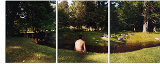
Photographers

David Hilliard


            Bio: http://en.wikipedia.org/wiki/David_Hilliard_%28photographer%29           
            http://www.davidhilliard.com/
            http://www.aperture.org/books/browse-by-photographer/d-h/david-hilliard-photographs.html

David Hockney


            Bio: http://en.wikipedia.org/wiki/David_Hockney
            http://www.hockneypictures.com/
            http://www.artnet.com/artists/david-hockney/

Horst P. Horst


            http://www.gallerym.com/artist.cfm?ID=59

Lori Nix


            Bio: http://www.artist-info.com/cgi-bin/search/user_search.cgi?action=show_bio&ID=25078
            http://www.lorinix.net/
            http://www.fastcodesign.com/1662890/lori-nixs-stunning-tiny-dioramas-depict-an-abandoned-world-slideshow

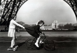
Robert Doisneau


            http://www.robertdoisneau.com/

Steven Meisel


            Bio: http://en.wikipedia.org/wiki/Steven_Meisel
            http://models.com/people/steven-meisel

**Tim Walker


            Bio: http://en.wikipedia.org/wiki/Tim_Walker
            http://showstudio.com/contributor/tim_walker

Tuesday, November 15, 2011

Font Study: ITC New Baskerville

Here is my behance link for the font study project!  Enjoy!

http://www.behance.net/gallery/Font-Study-ITC-New-Baskerville/2508113


Thursday, November 10, 2011

11/10 Letter Fountain


_ What are small capitals? How are they different than something set in ALL CAPS?
Does your font have small caps? If not name a font that does.
Small capitals are uppercase characters set at the same height and weight as surrounding lowercase letters or text figures. You use them if you do not want to underline or bold something within your text.  ITC New Baskerville does indeed have small caps.

_ What are ligatures? why are they used? when are they not used? what are common ligatures?
Does your font have ligatures? If not name a font that does.

A ligature occurs where two or more graphemes are joined as a single glyph. Ligatures usually replace consecutive characters sharing common components and are part of a more general class of glyphs.  I honestly do not know if ITC New Baskerville has ligatures, but I have tried to look.  I do know that Garamond does.

_ What is the difference between an inch mark and a quote mark (smart quote)?
Quote marks are placed at the beginning and end of a given quote.  An inch mark are two straight identical lines that represent the measurement of an inch.  Sometimes the quote marks are curved as well.

_ What is a hyphen, en dash and em dashes, what are the differences and when are they used.
The hyphen ( ) is a punctuation mark used to join words and to separate syllables of a single word.  The en dash is a short dash, the width of an en, used in punctuation.  The em dash is just a long dash used in punctuation usually used to signal interruption.

Thursday, October 20, 2011

Type Classifications

Classifications:

Old Style
Characteristics:
1. The base serifs have no or ar hardly any rounding at the bottom
2. The cross-bar of the lowercase e is horizontal
3. The top serifs are roof-shaped and hae a triangular form
 

Fonts:
1. Garamond
2. Bembo
3. Plantino
4. Albertina
5. Palatino


Transitional
Characteristics:
1. The base serifs are only a little or virtually not rounded at the bottom.
2. The cross-bar of the lowercase e is horizontal
3. The serifs are sometimes rounded, sometimes sharpened, and in a few cases already strictly horizontal as with the didones.


Fonts:
1. Baskerville
2. Concorde
3. Fournier
4. Perpetua

5. Times New Roman


Modern
Characteristics:
1. Strong emphasis on vertical stroke
2. thick-thin contrast is vertical
3. sharp contrasts, symmetry and sharp transition to the straight serifs.
 

Fonts:
1. Didot
2. Bodoni
3. Walbaum
4. Linotype
5. Vertrina


Slab-Serif
Characteristics:
1. Only a little thick-thin contrast
2. The heavy rectangular serifs are as thick as the letters themselves
3. The serifs are the defining characteristic of slab-serif
 

Fonts:
1. Antique
2. Clarendon
3. Beton
4. Memphis
5. Serifa


Humanist
Characteristics:
1. Line widths are visually equal
2. Extension of the lowercase "e" points to the right instead of turning toward the crossbar
3. Lowercase "g" has a classic form with two bowls
 

Fonts:
1. Gills Sans
2. Profile
3. Syntax
4. Frutiger
5. Myraid


Geometric
Characteristics:
1. No Serifs
2. Line thicknesses are only visually and minually corrected
3. The axis of the roundings is vertical
 

Fonts:
1. Futura
2. Avant Garde
3. Eurostile
4. Erbar
5. Neuzet Grotesk


Grotesk/Gothic
Characteristics:
1. Line thicknesses seem to be equal but have a slight visual think-thin contrast
2. Axis of rounding is vertical
3. The ascender height is usually  equal to the capital letter
 

Fonts:
1. Akzidenz Grotesk
2. Neue Helvetica
3. Univers
4. Arial
5. Franklin Gothic

Thursday, October 13, 2011

New Baskerville


Baskerville is a transitional serif typeface designed by the English gentleman printer John Baskerville in 1757. Baskerville had also mastered the craft of engraving headstones, a knowledge that influenced his design process.

Tuesday, September 20, 2011

Project 1: Weather/Modular Grid

Behance: Project 1

This is the link to our lovely first project, which I actually had a lot of fun doing.  Hope you all enjoy!


Friday, September 16, 2011

TACO!

This is pretty old, but I forgot to upload our awesome taco type!  We used colored pencils from the shop in the design building.  The colors represent the different colors in a taco.


Tuesday, September 13, 2011

Living and Dead Typographers.

Well now that I actually did the right assignment, here are the bios on my selected living and dead typographers.

Living Typographers
Ed Benguiat (1927-)
After working for Esquire magazine and running his own Sudio, Benguiat joined Photo-Lettering Inc. in 1962 becoming head of its publishing department and designing literally hundreds of display typefaces.  He was part of the rise of the International Typeface Corporation in 1970 and helped Herb Lubalin launch its marketing publication.  He is credited with more than 600 typefaces, among them ITC Souvenir, ITC Tiffany, and ITC Bauhaus.


Christian Schwartz (1977-)

Schwartz’s first typeface was released by FontHaus when he was only 14 years old.  After receiving his degree from Carnegie Mellon University, he worked at MetaDesign and Font Bureau and then left to start freelancing.  He loved to collaborate with other designers and he also liked to work on his own fonts.  In 2006, he established Schwartzco, Inc. that focuses on speed and the detail that he puts into his typefaces.

Zuzana Licko (1961-)
Without any real training in typeface design, Licko used her knowledge from her Graphic Design degree to create multiple successful typefaces.  Most of her fonts emerged with the introduction to the Macintosh.  Licko tried to create modern typefaces of what previous designers have done.  Overall, Licko has about 30 different typefaces that include a wide variety.


Matthew Carter (1937-)
Carter had a yearlong internship punch-cutting at the printing house Ensechede in Haarlem, Netherlands and after that he freelanced for six years in London as a typemaker and then a type designer.  After making several typefaces, Carter and three of his friends established Bitstream.  After Bitstream’s time was gone, he co-founded Carter & Cone Type Inc, where he created multiple typefaces including Verdana for Microsoft. 


Hermann Zapf (1918-)
Zapf designed his first typeface, a Fraktur black letter called Gilgengart, for D. Stempel AG type foundry and Linotype GmbH in 1938.  He served in the Cartographic Unit of the German army during the World War II.  Zapf designed Palatino and Optima for D. Stempel AG.  Zapf has been one of the few type designers to produce designs in metal, phototypesetting, and computer.

Dead Typographers
Claude Garamond (1480-1561)
Claude Garamond was one of the first punch cutters to work independently and sell his fonts to printers.  His first Roman appeared in 1530 in Paraphrasis in Elegantiarum Libros Laurentii Vallae by Erasmus.

Erhard Ratdolt (1447-1528
Erhard Ratdolt moved from Germany to Venice in 1475, where he established a printing business.  He designed and printed perhaps the first recorded type specimen sheet in 1486, showcasing his black letter, Roman and Green typeface designs.

John Baskerville (1706-1775)
John Baskerville established a printing business and type foundry in 1750.  With John Handy as his punch cutter, Baskerville designed various original Romans.  As a printer, he experimented with custom inks, producing rich blacks, and with paper, achieving highly glossy surfaces. 

Firmin Didot (1764-1836)
Firmin Didot is a representative of the third generation of the Didot family, with roots in printing and publishing as far back as the mid eighteenth century.  He designed the first Modern Roman in 1784, with thin serifs and high contrast in its strokes – all contemporary Didot typefaces are based on his work.

Giambattista Bodini (1740-1813)
Giambattista Bodini was director of the Stamperia Reale, the official press of Ferdinand, Duke of Parma for 45 years.  Taking cues from the Baskerville’s Romans with high contrast and Didot’s flat serifs, Bodoni designed his own Modern typeface in the late 1790s.  After his death in 1813, his widow Paola Margherita finished Bodoni’s Manuale Tipographico, an exemplary, exhaustive type specimen of Bodoni’s collection and own designs.


Gomez-Palacio, Bryony, and Armin Vit. Graphic Design, Referenced: a Visual Guide to the Language, Applications, and History of Graphic Design. Beverly, MA: Rockport, 2009. Print.

Past Designers

Alvin Lustig (1915-1955)

Alvin Lustig began his career with his love of magic.  His love for magic and his posters that advertised his talent is what brought attention to the fact that he was indeed a good designer.  He then began school at the Los Angeles Community College and the City’s Art Center School.  A couple years after, he began a business that was slow getting of the ground, but his work showcased a new beginning.  The rest of his career revolved mainly around designing book covers.  His life ended due to diabetes in the year of 1955, at the age of 40.

Cipe Pineles (1908-1991)

Originally from Vienna, Cipe Pineles enrolled in Brocklyn’s Pratt Institute, in which she developed an impressive portfolio.  She maintained plenty of job interviews from her work, but since she was a woman, she did not maintain any jobs.  This was until she joined a small firm called Contempora.  She made her way at this firm and began her main career as art director for magazine companies like Vanity Fair, House and Garden, and Seventeen.  During her career, Pineles made her way through a male-dominated industry and turned out to be very successful until her death in New York in 1991.

Bradbury Thompson (1911-1995)

Bradbury Thompson received a degree from Washburn College in Topeka, Kansas, which is where he had become the editor and designer of the college yearbook.  Right out of college, Thompson began working for magazines as the art director and made a name for himself.  He then became editor and designer of Westvaco Inspirations for Printers.   He demonstrated typography for 61 issues, until the production ceased.  After the production ceased, Thompson maintained jobs as art director for multiple magazines and overall designed up to 30 layouts for magazines.  He also created a typeface due to his curiosity of typography.  His font was called Alphabet 26.  He passed away in New York in 1995.

Erik Nitsche (1908-1998)

Erik Nitsche was originally from Switzerland, however, to jumpstart his career, he moved to Germany to work with his professor and worked at Pressa. He then moved to Paris to work for a printing house and during his stay in Paris, he had earned money for multiple magazine illustrations.  He then moved to Los Angeles and New York to become editor of illustrations for magazines.  He then became art director for Saks Fifth Avenue and at the same time he continued to complete freelance work.  He then started to work for General Dynamics and did some print ads that got the attention of the CEO.  The CEO let Nitsche be in charge of the identity of the company.  Towards the end of his career, Nitsche moved back to Switzerland and established his own company but then moved back to the states to work on children’s books.  He then moved to Germany to work on designing stamps and then moved back to the states where he died in 1998.

Ladislav Sutnar (1897-1976)

Ladislav Sutnar went to three different schools in Prague in which he learned everything he needed to become successful in multiple things like making puppets to designing magazine covers.  He was then asked to design an exhibit at the New York World Fair, which was cancelled, but ended up staying in New York.  He then became art director of Sweet’s Catalog Service, in which he stayed for two decades.  He then published New Patterns in Product Information in which he started what is now known as information design.  The rest of his career consisted of working for multiple magazines.

Thursday, September 8, 2011

Adrian Frutiger and Univers

Adrian Frutiger was one of the great designers that made typeface what it is today.  He started off his designer years in his home country, Siwtzerland, and attended a Swiss school of design.  Right out of school, Frutiger acquired a job in France at a typefoundry in which he would work with various typefaces and typesetting.   From his knowledge that he gained from school and his first job, he has impacted the typeface world.  He is known for creating the typefaces of Universe and Frutiger.  Of course, those are not the only typefaces that hold his name as the creater.  Herculaneum and Glypha are also on the long list of typefaces he created.  During his time as a designer, he would create different fonts and then spend a lot of time refining them to make a complete series of a particular font.  This was the case when it came to Univers, Frutiger and Avenir.  On top of creating multiple popular fonts, he has published many books as well.  The amount of knowledge and gifts he has given to the world of typography seems like too much to list, but all of the typefaces and knowledge we use everyday had to come from somewhere and we just have to be grateful and admire their outstanding work.

The Univers typeface is unique in many ways, but the most unique thing is how every member of the font is named.  Instead of names, like all the other fonts, they are named by numbers.  The Universe grid is very different as well.  The grid organizes the different members of the font by stroke weight and kerning.

Sunday, August 28, 2011

“Typographical design should perform optically what the speaker creates through voice and gesture of his thoughts.” — El Lizzitsky


Define Weight
            The density or the lightness of the individual letterforms

Define Width
            The width of the font is how stretched out a letter is or how narrow it is.

Define Style
            Level of boldness or kind of letter within a typeface

Define Font
            The term “font” relates to a specific size and style of a given typeface

Define Typeface
The term typeface is used to describe a complete alphabet including letters, numerals, punctuation marks, accents, special reference marks etc.

Define x-height
            The height of the lowercase x

Define Cap Height
            The height of capital letterforms

Define Leading
            The spacing between lines of letters

Define Letterspacing (tracking)
Applying tiny spaces in-between small cap letters to make them more agreeable to the eye

How is type measured in inches, mm, points, or picas?
            Type is usually measured in points

Define Point
            A point is the smallest unit of measure and a division of the larger pica

Define Pica
A typographic unit of measure corresponding to 1/72 of its respective foot, and therefore to 1/6 of an inch

How many points in an inch?
There are 72 points in an inch

If a letter is set in 36 pts about how many inches tall is it?
            ½ of an inch tall

How many picas in an inch?
            There are 6 picas in an inch

How many points in a pica?
            The pica contains 12 point units of measure

Thursday, August 25, 2011

Type Questions


Define the word “grid”
A grid is a structure made up of horizontal and vertical lines, and on it the designer places components such as headings, text, images, captions etc.

Why do we use a grid? What are the benefits or functions?
The designer uses the grid so that the information is in a sequential and logical manner and so that readers can easily navigate their way through the page.

What is a modular grid?
The module is an area calculated in depth by the text leading and width by the text line length.

Define and Illustrate: margins, columns, grid modules, flowlines, gutter
Margins: that usually empty space between the trim (where the page is cut) and the live printing area (primary text and graphics) of the page
Columns: Vertical divisions of space used to align visual elements
Grid Modules: Spaces created by columns, rows, and margins that support text and visuals. Content will determine the amount of active modules
Flowlines: Support for vertical columns by dividing the page into horizontal intervals to provide additional alignment points across a grid
Gutter: The inside margins or blank space between two facing pages


Define Hierarchy
Hierarchy is achieved through the proper and conscious implementation of visual prompts that emphasize significant content within the design while gradually minimizing the attention needed for other elements.

Define Typographic Color
Apparent blackness of a block of text resulting from the combined effect of the relative thickness of the strokes of individual characters, their width and point size, and the leading (line spacing) used in setting the text.

What are ways to achieve a clear hierarchy?
Ways to achieve clear hierarchy include exaggerating the size of text or image, by isolating a design element, or by employing additional graphics that call attention to a specific place in the layout.

Define White Space
A place on the page where no test or pictures are placed.  White space is the eternal quest of graphic designers who struggle to justify to clients or higher ranks the blank real estate in brochures, websites, stationary, and other design projects.

Define Contrast
Contrast operates on two levels: how the elements within the layout contrast and how the layout itself contrasts with its context.

Type Activity

Our activity was to find some objects that could spell out the word "Type".  This is what we came up with: